Primary page background
This page is the single source of truth for site components, tokens, and project-page patterns.
Edit a component in src/components/ — every project page imports from here. Use the live
previews below to QA before shipping updates to Work, Play, and case studies.
Color tokens
Main reading text
Header menu links and subtle emphasis text
Default for dark links
Hover for dark links
Default for softer links
Hover for softer links
Secondary labels and UI hints
Cards, separators, subtle outlines
Typography
Industrial design, made tactile.
Process and outputs
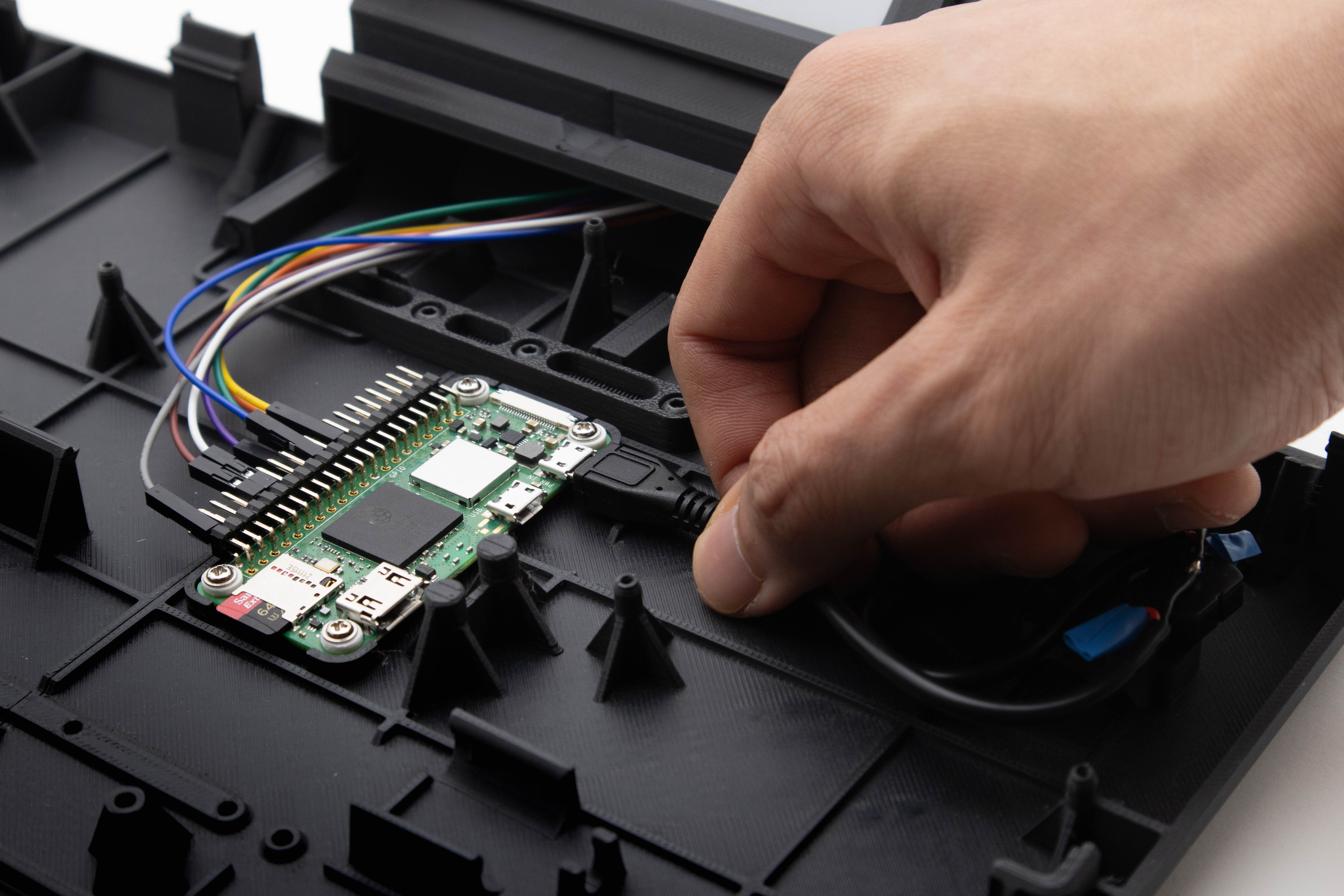
Materials and ergonomics
Used for narrative sections. Keep width around 52-62ch so dense process writing remains easy to scan.
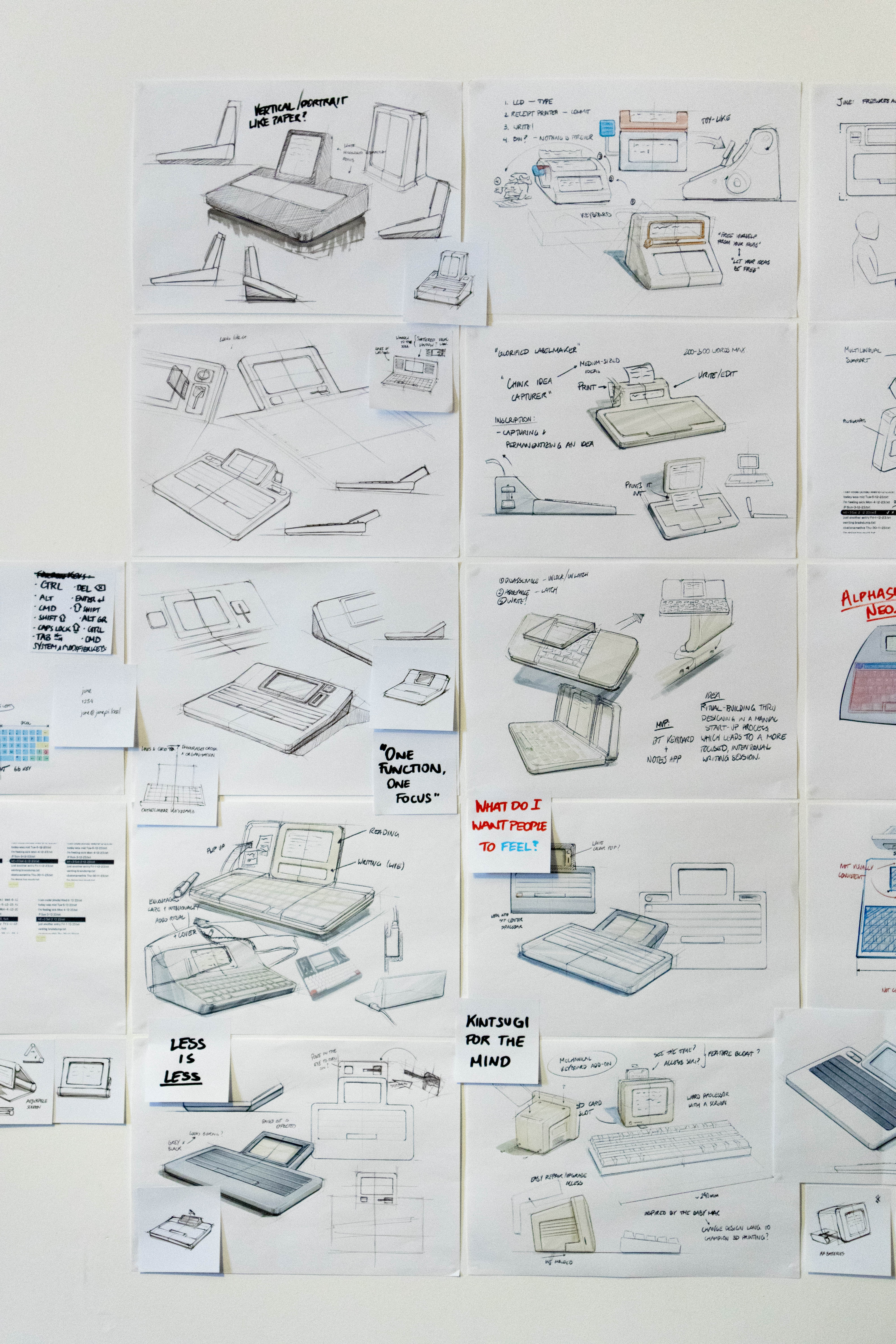
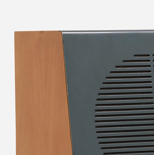
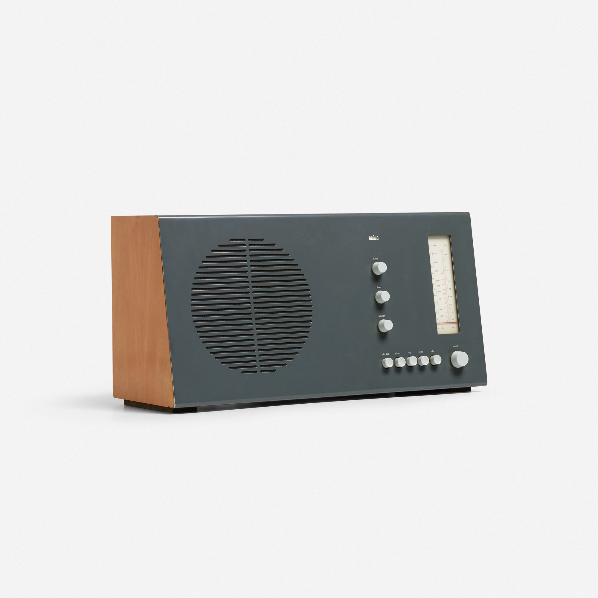
 Foam model before final chamfer direction
 Spacing
Layout rules
Fluid site gutter max(1em, calc((100% - 60em) / 2))
Keeps content comfortable at every size while preserving edge breathing room.
Core unit 1em
Use 1em steps before introducing custom values so pages feel related.
Page transition 0.5s overlay fade
Shared entry/exit timing from `Layout.astro` keeps navigation calm.
Component library
14 components across site chrome and project pages. Each card shows a live preview, source file, props, and where it is used today.
Site chrome
Header
Global nav, wordmark swap on inner pages, menu overlay.
Rendered at the top of this page.
Footer
Copyright line anchored to page bottom.
Rendered at the bottom of this page.
SectionSidebarNav
Scroll-spy section nav for long single-column pages.
Fixed nav on the left of this page (desktop).
Project shell
ProjectLayout
Case-study page shell: Layout + Header + main slot + Footer + project.css.
Wraps project pages — see any case study (e.g. Tapico).
Project content
ProjectTagline
Large display headline under the hero.
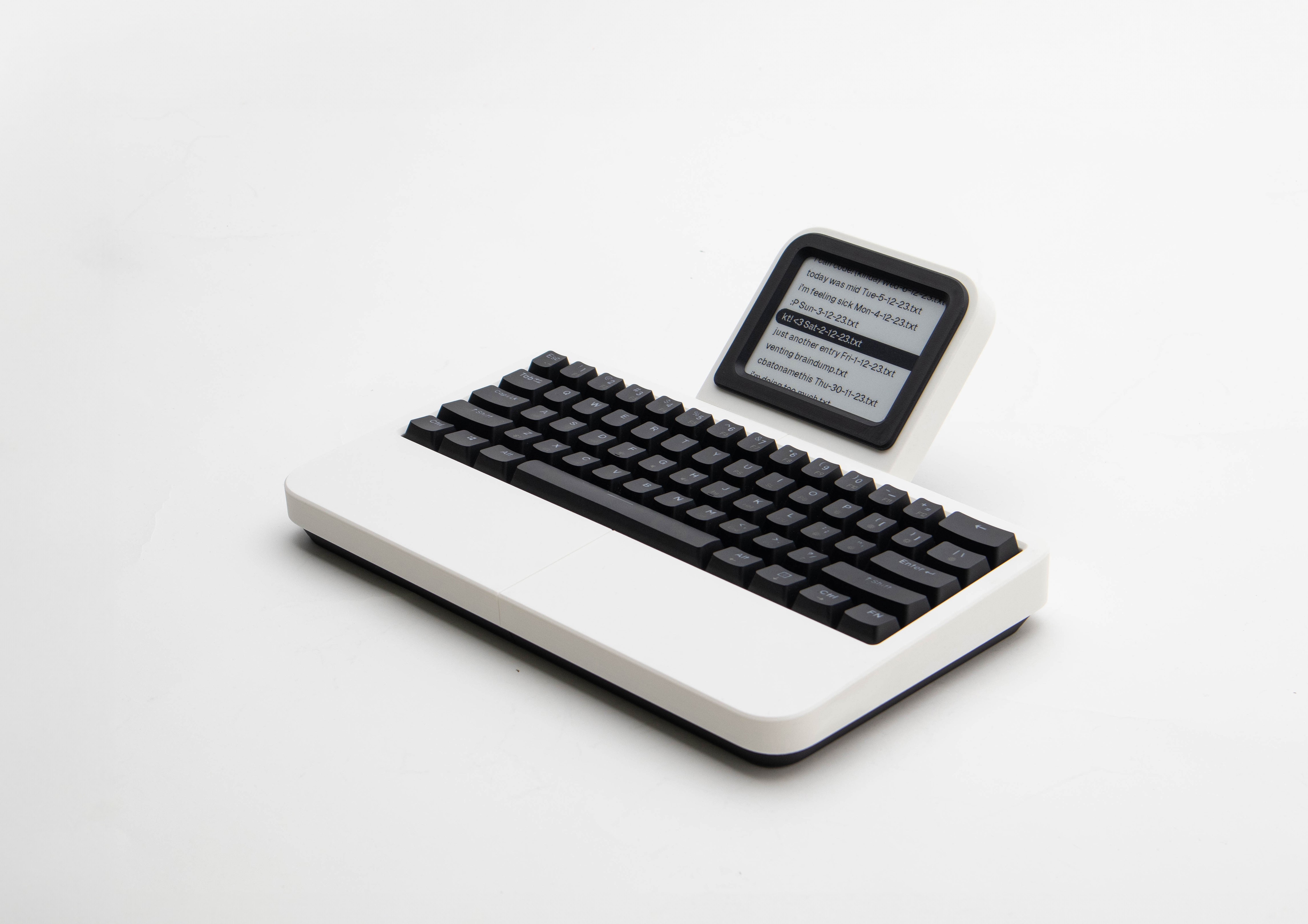
A calculator, but for words.
ProjectProse
Main narrative body for case-study explanations.
Designed for narrative flow between media modules. Keep this block comfortable and readable, then let images carry detail.
ProjectSectionTitle
In-page section break heading (Research, Process, etc.).
Research
Project media
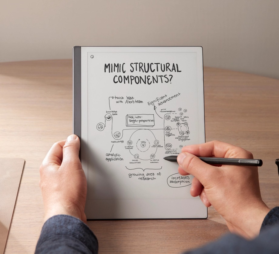
ProjectHero
Lead image at top of each project story.
ProjectImage
Full-width or constrained standalone image between prose blocks.
ProjectGrid
Two-, three-, or five-column media clusters.
ProjectCaptionImage
Grid cell with overlay caption (competitor refs, labeled shots).


ProjectDetailImage
Grid detail shot with optional caption variants.
ProjectContextImage
Moodboard/context cell with caption above image.
ProjectReferenceImage
Linked reference tile with overlay caption.
Pending patterns
Raw markup still used on some project pages — not yet extracted into components. Promote these when a second page needs the same pattern.
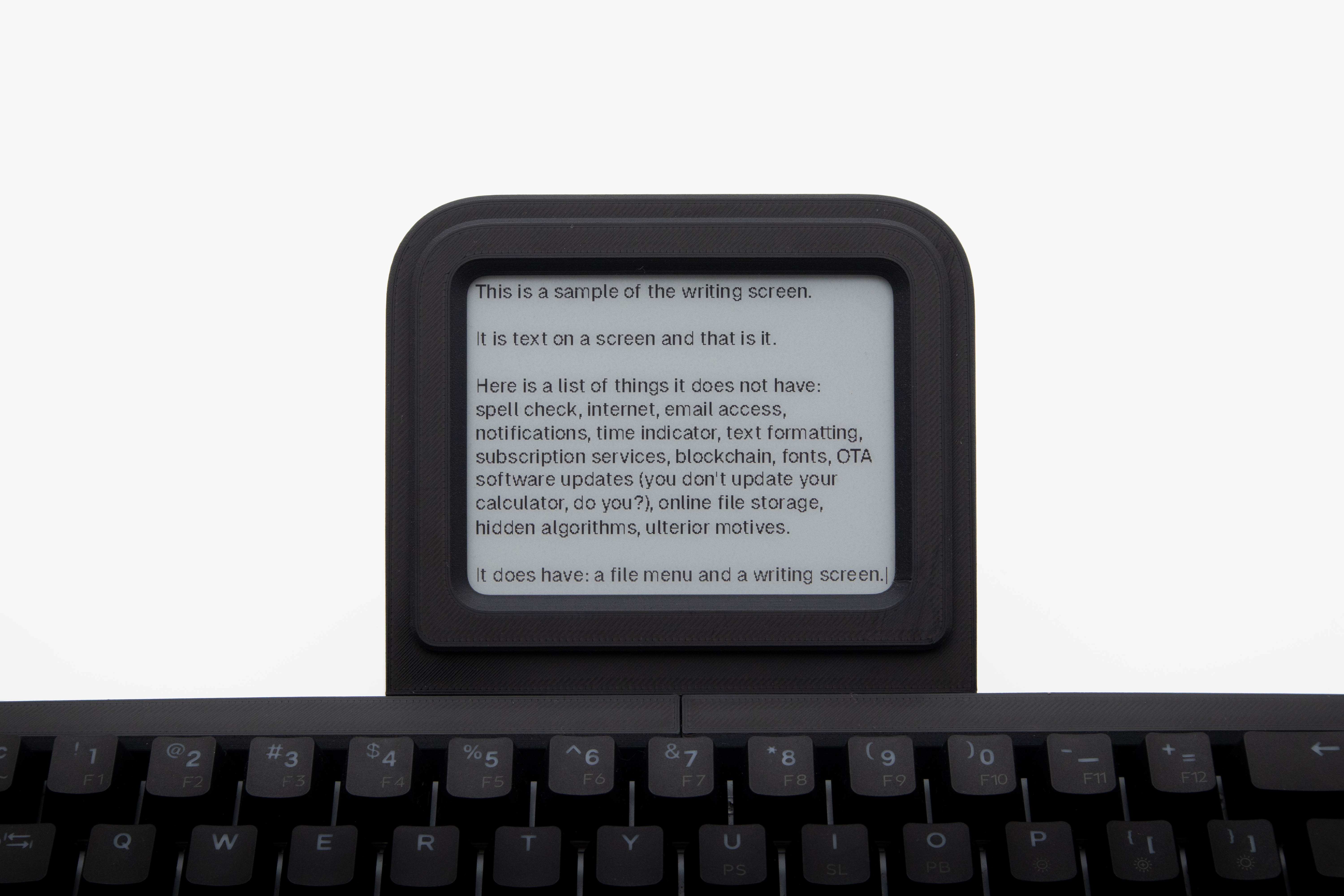
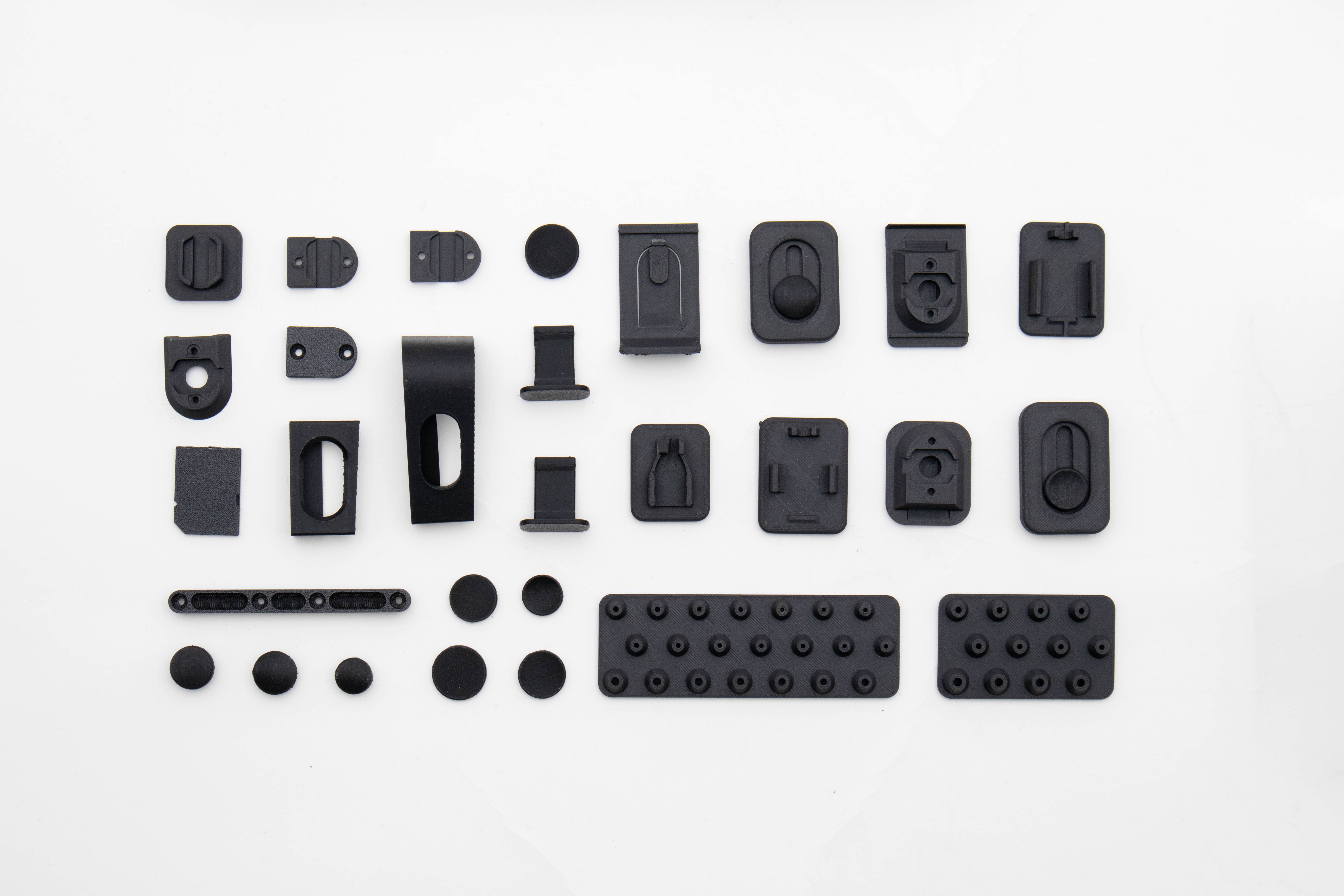
Captioned constrained image .project-media--constrained + .project-caption--black/dark
Used on: Tapico. Full-width image with caption above (V2 exploded view, keyboard). Candidate: extend ProjectImage with caption prop.
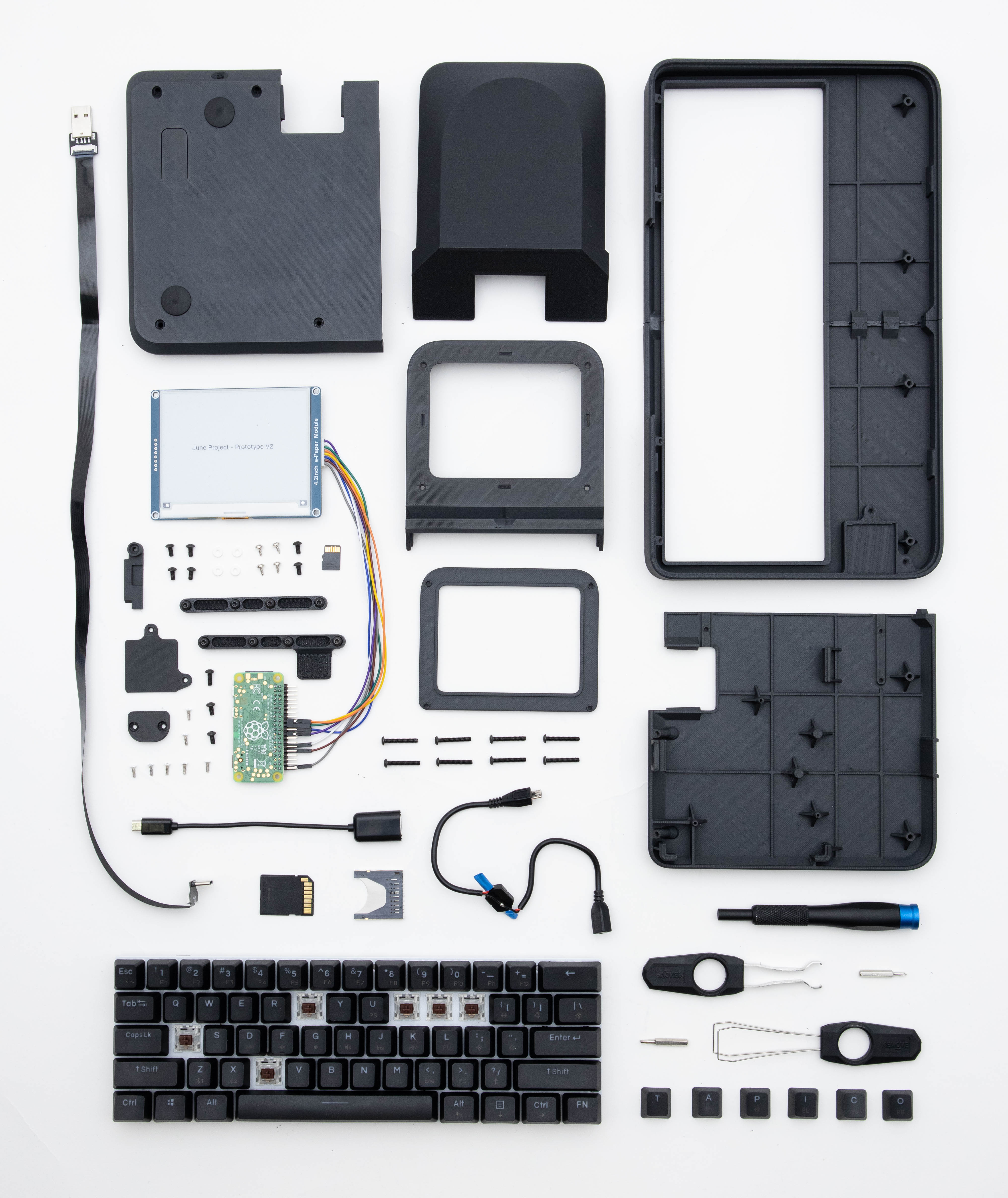
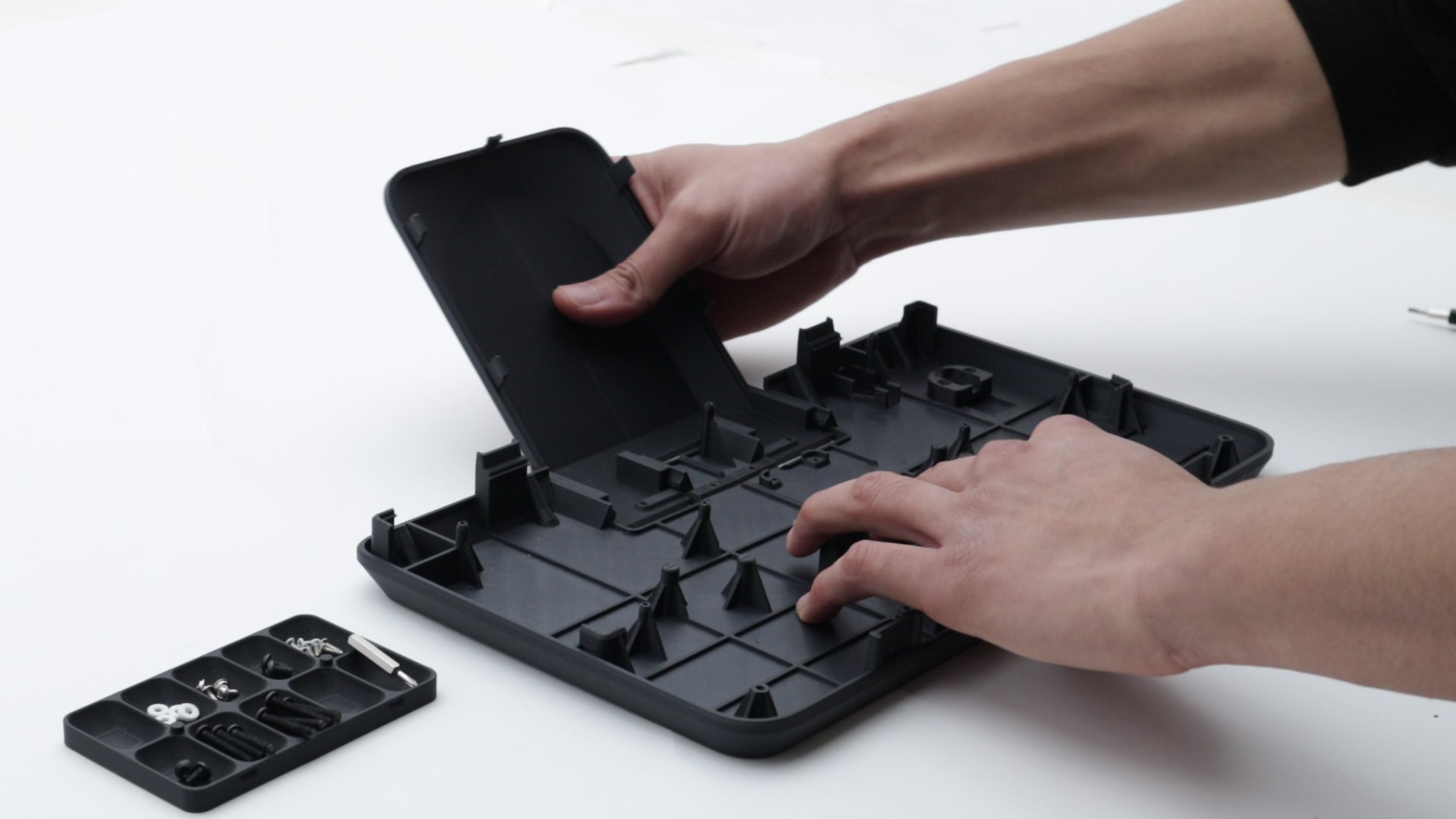
Stacked grid cell .project-cell--stack
Used on: Tapico. Tall two-image stack inside a 5-column grid. Candidate: ProjectDetailImage stack variant or ProjectStackedCell.
Responsive hide / show pair .project-hide-mobile + .project-show-mobile-only
Used on: Tapico, Conic Collection. Desktop grid cell hidden on mobile, alternate full image shown instead.
Interaction sample
Hover tone should stay subtle. This link uses the same transition behavior as inline project links: read case-study details.